


First of all, I'd like to thank the CF admins for giving my design a shot. My friends were literally calling me in the middle of the night to tell me the news, and unfortunately I was sleeping, but when I woke up I saw all the messages and it just made my day. As of this moment, I think the voting between Nikhil's version and the current logo is pretty neck and neck, and a lot of people seemed to have liked it, so we decided to improve it to the point that it would be a real candidate.
Finally, I want to thank nikhil1_raghav for improving my original idea (It's basically a joint project at this point), and also purplesyringa for creating the voting post, and, at last, those who shared their feedback, which was much appreciated.
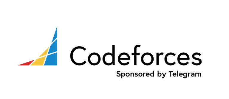
Now to the logo itself: OG CF Colors, denoting the rating distributions, just like in the current one. Also added the Telegram Sponsorship text and some other adjustments. Let me know what you guys think!
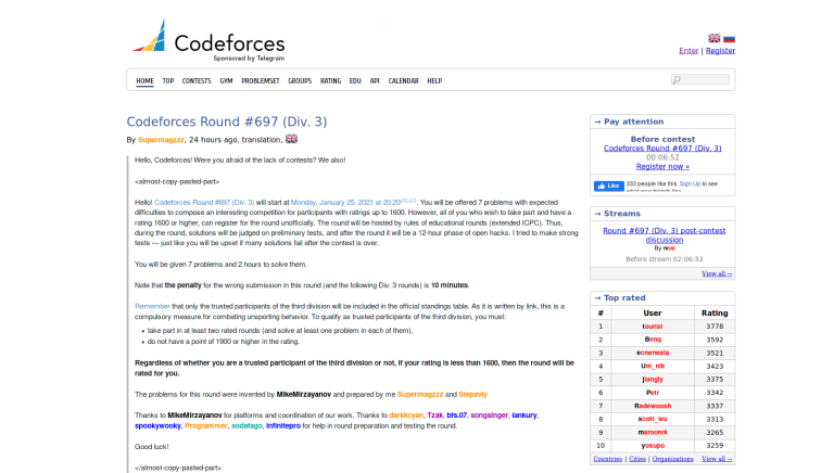
This is how the homepage would look like
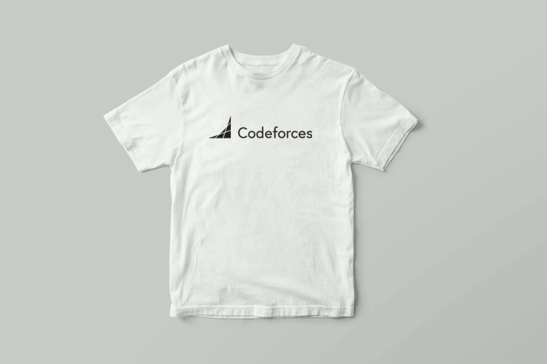
Designed some t-shirts, check out all of them here


OP Logo
Auto comment: topic has been updated by nikhil1_raghav (previous revision, new revision, compare).
Auto comment: topic has been updated by nikhil1_raghav (previous revision, new revision, compare).
I like this new LOGO!.
purplesyringa can you put this one as Candidate 3?
Sure. Updated.
'Sponsored by Telegram' looks too bold to me on small size though.
This one was better tbh
What would it look like if you moved the text up, so that the bottom of the "Sponsored by Telegram"-text would line up with the bottom of the logo?
Similar to the formatting used in my first post's logo. Seemed kinda cramped for me.
I like the logo, but I don't like change
looks clean but imo the current logo compliments the old-school style of the website