


Hello CF! Following IOI 2022, I did some analysis from the scoreboard. Here are my findings.
Country Standings
This has already been posted on codeforces here, but mine is slightly different as it uses the total score instead of the average (hence countries with less than 4 participants are ranked higher than the ones with 4 in mine).
Top 5:
| Rank | Country | Average Score |
|---|---|---|
| 1 | CHN | 577.50 |
| 2 | USA | 477.14 |
| 3 | JPN | 467.77 |
| 4 | KOR | 406.11 |
| 5 | CAN | 376.01 |
Problem Score Distributions
Most people do better on some tasks than on others. These graphs can answer the following questions:
- What medal would I get if the score was entirely based on one task?
- Which was the easiest task to get x pts on?
- How many people got >x pts on each task? etc
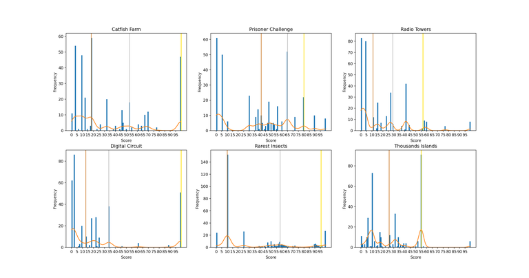 (You can see a higher resolution version here)
The vertical coloured lines represent the "cutoff" score for each medal for each task (ie bronze line corresponds to median score, silver corresponds to 75th percentile, and gold corresponds to 91.67th percentile.
Country Score Dispersion
Following day 2, some people found that some online contestants from the same country had similar scores a bit "sus". In this graph, we can see the distribution of the coefficients of variation of the scores of each country's contestants. ie for each country:
- Take the score of the 4 contestants.
- Find the standard deviation and mean
- Find the coefficient of variation (standard deviation / mean)
Plot the distribution of said coefficients over all countries, separately for online and onsite ones.
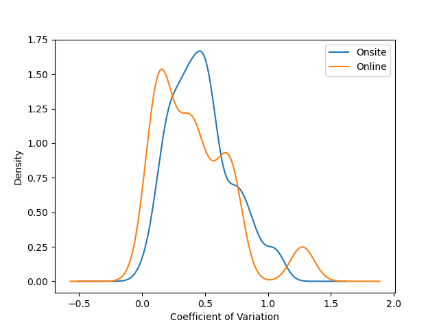
Note: the distribution has been estimated using a guassian KDE, which is why there are probabilities >0 for values of x < 0. The actual smallest coefficients are 0.0287 for onsite participants (JPN) and 0.0450 for online participants (CHN).
Note that despite the fact that the average variation is less for online participants, the sample size for them is quite small (n=17).
Sources
These were generated using data from the scoreboard, available at https://ranking.ioi2022.id.
Online/Onsite participants were found at https://status.ioi2022.id


didn't even add r*ssia after the "outrage". nice play
"r*ssia" that made me laugh
A play of a true Nazi.
wait, actually, ru**ia is in the list. the thing is that they're just labeled as
IOI.but it's not the r*ssia we all know and-- mainly because there is also belarus with which no one really has a problem with but they do because they are accessories to whatever this is?? unfortunately I can't fully comprehend the entire political situation and its implications so let's just comment about russia
Great work on the plots, they're pretty informative. This reminds me of a similar (but very brief) analysis here.
However, I feel like there's an issue with the final plot. Firstly, it doesn't make sense to take a coefficient of variation for just 4 data points (I understand you wanted to use it as a proxy for how suspicious the scores are). Even if it did, estimating it using a Gaussian kernel density estimator is quite overkill, and I don't understand why anyone would prefer it over using a histogram (which is much simpler and more accurate to the original situation) when you have a decent number of datapoints (countries) to plot a histogram for.
I just thought that a smooth line would show a "clearer" trend, but didn't give much thought to it tbh (this is what happens when you make random graphs in an airport when going home from IOI).
This is how it looks with a histogram.
Do you suggest using something else other than coefficient of variation as a metric? I get what you are saying, but this is true for any measure of dispersion if I understand correctly.