


Hi everyone. I was curious what my rating graph would look like if I plotted it with problems solved on the X Axis instead of time. I have big gaps in my practice, and I barely do any codeforces for the majority of the year (only the occasional contest for fun).
I wrote a python script using the CLIST and Codeforces API which can graph your Rating vs Count of Problems Solved. I can also filter to see how you're improving if you only count problems of a specific rating.
This is my normal graph: 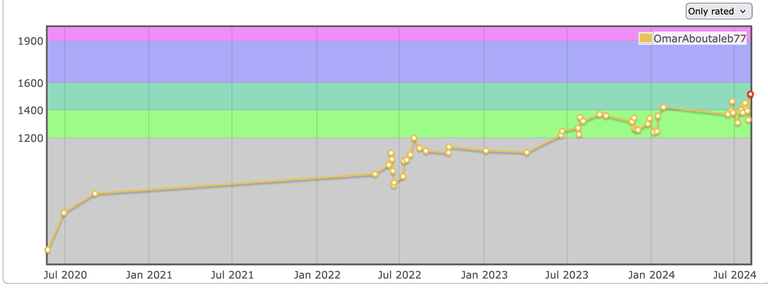
This is my Rating vs Count of Problems Solved Graph: 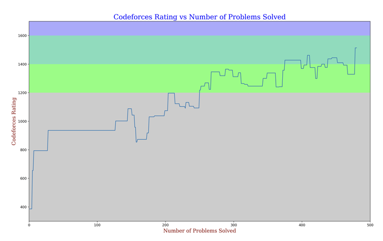
This is my Rating vs Count of Problems Solved Graph if we only count problems with a rating >= 1200*: 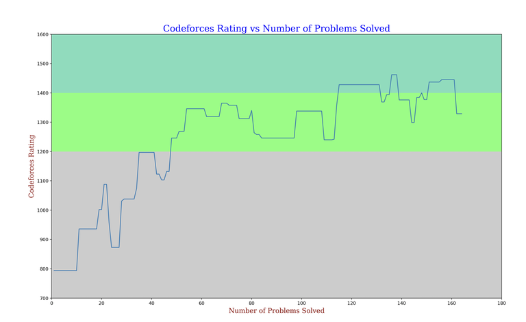
This is my Rating vs Count of Problems Solved Graph if we only count problems with a rating >= 1400*: 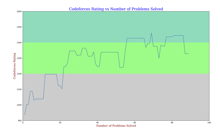
If anyone is interested I can plot your rating graph as long as you have a clist account with your codeforces account attached to it.
* Contests which have problems that don't have a rating yet aren't included.


Check mine please with all problems(same nickname).I Hope you did not just divided count of problems and placed marks on graph. :)
Here you go
Tysm :)