


I heard about the Codeforces shirt design the day before the deadline, and I looked at the designs and they were almost all memes. I thought of making a serious design, since I am not good at memes. (I am also not good at comp prog.)
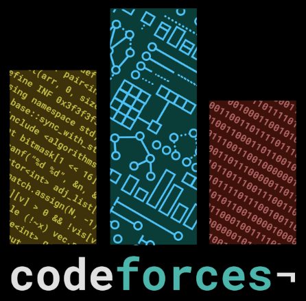
Most programming shirts that I liked have nice abstract patterns based on algorithms, like the Yandex.Algorithm 2015 shirt. So I wanted to add a bunch of cool diagrams of algorithms. And I decided to use black, because, well, black is nice. I came up with the design of overlaying algorithms in the Codeforces logo, but I could not draw enough different diagrams, so I used three components. You can see the whole design here:
Overall
I was inspired by the typography of Material Design, as well as the old Google Design. So I used Roboto Mono, which I think is very nice. The use of the not sign (¬) on the end of “codeforces” is also inspired by Google Design, and I think it’s cool. I have to admit that I didn’t fix the kerning here, but to my defense, it’s a monospaced font.
I was originally going to have everything as diagrams for algorithms, but I couldn’t come up with more. So I decided to use text, which was easier. The overlays for the bars are also tilted at a 30° angle because it made it look nicer.
Here, there are three different levels of abstraction, which all programmers operate in: the largest bar, the center blue bar, is for algorithms, which is the most abstract level of thinking. I think most people are like me, that I think in terms of the general algorithm first, before the actual code. In my head, I visualize what the algorithm looks like. This is what the blue bar shows.
The next largest bar is the yellow bar, which is a lower level of abstraction. It represents the code that we actually write in order to implement the algorithm. The smallest bar here, the red bar, is the lowest level. It is binary, which represents machine code, the actual compiled program. (Usually, when people think “computers”, they think binary, so I wanted to include that too. But not all of the design.)
So that it isn’t just a regular programming shirt, I wanted to show things that were unique to competitive programming. We’ll go through each bar one by one, from least to most abstract.
The red bar: binary
If you want to figure out what the binary means on your own, here’s the full picture:
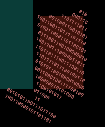
Done? It is not random. It is ASCII, in binary. Choosing ASCII is a deliberate choice, because knowledge of encoding appears in competitive programming sometimes. For example, c - 'a' + 'A' capitalizes the char named c, and it works because of ASCII. If you use a binary to ASCII converter and take the effort to type it all in, you’ll see it decodes to Codeforces Sponsored by Telegram. Codeforces alone is too short, sorry.
Initially, all the binary code fit in the bar, but it was too small, so I made it larger. You’ll also notice that the leading is different compared to the yellow bar, this is an optical adjustment. Not making it random is a conscious decision, since if it was just random it would be like any other programming shirt.
The yellow bar: code
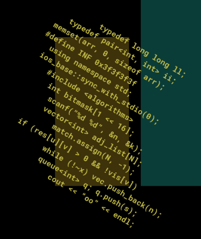
I’m sorry for using C++ code. But it’s a majority of the code we see here in Codeforces, so I think it’s only fair. In order for this to be unique to competitive programming, I picked samples of code that were unique to the competitive programming community. And most of these were from my code, also sorry.
For example, you have the classic ll, ii, and INF shorthands. There’s using namespace std;, which almost never appears in production code. There’s #include <algorithms> – I wanted to use #include <bits/stdc++.h> instead but decided against it. There’s ios_base::sync_with_stdio(0);, which has turned my TLE code to AC code too many times than it should. There is code that I’m pretty sure will only appear in comp prog: int bitmask[1 << 16];, while (!~x), cout << "oo" << endl;.
I was actually torn between using C++ or just pseudocode, and between using lines of disjointed code or an actual algorithm. I decided to do this because I think it represents competitive programming well.
The blue bar: algorithms
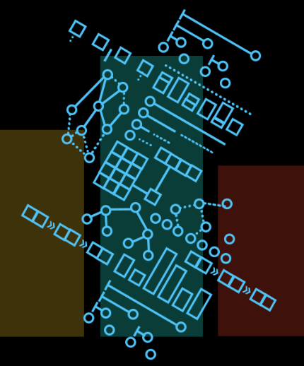
There are ten distinct algorithms or data structures here. Try to name them. Here’s a clearer, labeled picture of the diagrams:
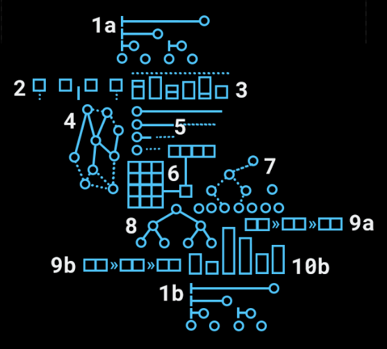
Before I spoil the answers, I want to talk about the design here. I was inspired by the algorithm designs of VisuAlgo. I limited myself to squares, circles, lines, and arrows. Not even numbers or labels. This was challenging, because I still wanted to make the algorithm recognizable based on the limited diagram.
On the choice of diagrams: I tried to divide them evenly between different areas and stuff. So, not all graph algorithms, because that would also look unbalanced, even if they are the ones that are easy to draw. So here, there are string algorithms, math algorithms, and data structures.
Okay, spoilers:
- Fenwick. I tried to distinguish from a segtree by putting the nodes in the order they should be, stored in an array.
- Manacher. The blocks are letters, the spaces in between should be a giveaway. Another giveaway is the pointer, which points to the gap in between, and is symmetric.
- Knapsack. I think this one is one of the easier ones: the dashed line represents the capacity, the blocks are things to bring. This is a common way to represent Knapsack so I think this is nice.
- Dijkstra. The heavy edges represent edges in the tree currently being built, and the dashed lines are edges not a part. It could be Kruskal, but if it was Kruskal there would probably be at least two components of lines.
- Binary exponentiation. Not obvious, I know, but this was what it’s supposed to represent. The dashed line symbolizes using a previous computation, ending with the base case.
- Matrix multiplication. The blocks representing entries of the matrix were pretty obvious, I think. So was the dark lines to represent the actual multiplication. I’m sorry for not having valid dimensions for the matrices, but space constraints.
- LCA. In particular, this is the LCA algorithm that goes up in steps of 2k until it reaches a common ancestor. The dashed lines represent the ancestors.
- Binary tree. No binary tree in particular, just a regular old binary tree.
- Linked list. This is also easy: the blocks represent the pointer and the data. This one has arrows, but the arrows aren’t actually visible in the bar, so the bar is only limited to circles, squares, and lines.
- Sorting. Except it doesn’t look like sorting. But this was supposed to be sorting. The diagram is similar to a lot of animations anyway, so I think it’s justified even if it’s not animated here.
How did I do? Hopefully my diagrams were good enough that you recognized half of them. I also hope that you like the shirt as a whole, and I did quite some time making it.


Am I the only one who couldn't even guess 1 algo?
I guessed binary tree all by myself B-)
I like the overall design, and you've put a lot of effort and great ideas into it. I would suggest revisiting the blue bar however. Most of the algorithms and data structures are incomprehensible, especially since they needed some cropping.
My two cents:
Ooh, great ideas. The cropping is what makes the algorithms not-as-visible, so I might consider omitting the difficult-to-recognize ones. Anyway, I’ll get it fixed for the final design.
In that case, can you also change
#include <algorithms>to#include <algorithm>? It would sound as cool but would compile.I really like your design by the way. I was relieved to see a non-meme t-shirt that looked good as well.
o h w h o o p s i a m b a d
Is your design available in high res?